Why Your Pantone Number Alone Can't Guarantee the Right Yarn Color
It's one of the most common scenarios in knitwear sourcing. A brand sends a Pantone number to their knitwear supplier — say, PMS 185 C, a bright red. The factory confirms they can match it. Then the sample arrives and something feels off.
Not wrong. Just... not what you pictured.
The number was right. So why didn't the color land?
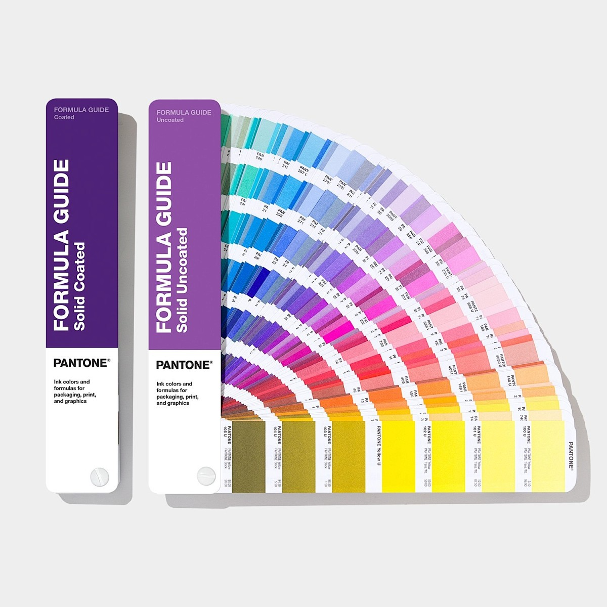
The Problem No One Talks About: Pantone Guides Age
Pantone updates its Formula Guide periodically — typically every 12 to 18 months. When a new edition is published, Pantone reformulates the ink recipes behind certain colors. The number stays the same. The physical color, in some cases, does not.
In practical terms: PMS 185 C in the 2022 edition might be a shade warmer or slightly more saturated than the same number in the 2018 edition. If you're looking at one and your factory is looking at the other, you're working from two different visual targets.
Multiply this by a full collection — maybe 8 to 12 colors across multiple styles — and small shifts add up fast.
Another Layer: Matching Pantone to Yarn Is Not Automatic
There is a second reality most new brands don't anticipate. A Pantone swatch is an ink-on-paper standard. Yarn is a three-dimensional material with its own texture, luster, and light absorption. The same color lives differently on paper versus on a wool-cotton blend versus on 100% acrylic.
This means your sweater manufacturer is not simply "reproducing" your Pantone number. They are solving a translation problem: find the closest commercially available yarn color that reads like your swatch — given the fiber, the stitch structure, and the lighting conditions your product will be seen under.
That translation is never one-to-one.
How to Get This Right
1. Align on the Pantone edition first. Before sending a tech pack, ask your supplier which Pantone Formula Guide edition they use. Make sure you are referencing the same one. If yours is newer, mention it.
2. Send a physical swatch when you can. A Pantone number is a starting point. A fabric cutting, a yarn wrap, or even a good-quality printed reference is a much stronger target for the factory to work toward.
3. Accept that yarn matching is interpretation, not replication. The factory is not a printer. They are navigating a limited universe of yarn suppliers and stock colors. A 95% match is often excellent work — especially for blended or textured yarns.
4. Use lab dips for critical colors. If a specific shade is non-negotiable for your brand, request a lab dip. The factory dyes a small batch of yarn to your spec, knots it onto a card, and sends it back for your approval. This takes extra time, but it closes the gap between "close" and "exact."
What the Better Brands Do
They don't just send a number.
They send a Pantone reference plus a physical reference plus a note on which edition they're using. They understand that color matching in knitwear is a conversation, not a command. And they work with a sweater manufacturer who treats it the same way.
Summary
A Pantone number is a good starting point — but it's not enough on its own. Editions change. Paper and yarn don't match. And without a physical reference and a conversation about tolerances, the same number can lead to two very different sweaters.
The fix is clear: align your Pantone edition with your factory before production, send a physical reference whenever possible, and treat color matching as a collaborative process — not a one-time instruction.
If you want to learn more, please contact us.
We are a professional sweater manufacturer with more than 30 years experience.
We can provide you personalized custom sweater service.
- Posted in Color Matching Guide, Custom Knitwear, Knitwear Production Tips, Knitwear Sourcing, Pantone Color Matching, sweater manufacturer, Yarn Color Matching